
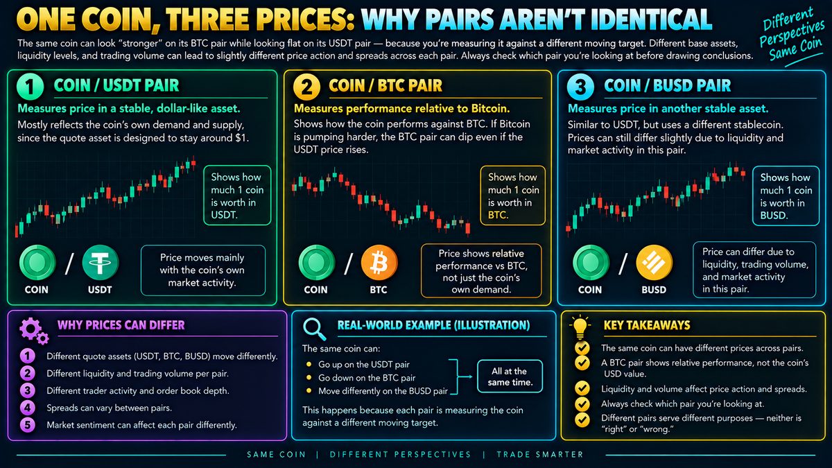
The same coin can look "stronger" on its BTC pair while looking flat on its USDT pair — because you're measuring it against a different moving target. A USDT pair shows price relative to a stable dollar-like asset, so it mostly reflects that coin's own demand. A BTC pair shows relative performance against Bitcoin, so if Bitcoin is pumping harder, the BTC pair can dip even while the USDT price rises. Add in different liquidity levels and trading volume per pair, and you get slightly different price action and spreads across each one. Always check which pair you're actually looking at before drawing conclusions about a coin's strength.
Why the Same Coin Shows Different Charts
Every coin can be traded against several other assets, and each of these is called a trading pair. A pair simply describes what you are exchanging for what. If a coin is paired with a stable dollar-like asset, often called a stablecoin, that pair shows how many of those dollar-like units one unit of the coin is worth. If the same coin is paired with Bitcoin instead, the chart shows how much Bitcoin one unit of the coin is worth. These are two different measuring sticks, and that is the entire source of the confusion many beginners run into.
What a Stablecoin Pair Reflects
A pair quoted against a stablecoin tends to move mostly based on demand and supply for that specific coin, because the stablecoin itself is designed to hold a roughly steady value. So when people say a coin is "up" or "down" today, they are usually talking about this kind of pair. It gives a fairly direct read on how the market currently values that asset in familiar dollar-like terms.
What a Bitcoin Pair Actually Measures
A pair quoted against Bitcoin is not measuring the coin in isolation. It is measuring the coin's performance relative to Bitcoin's performance. Imagine a coin worth 100 dollar-like units today. If tomorrow the coin is worth 110 in dollar-like terms, but Bitcoin has also risen sharply in dollar-like terms, the coin's price measured in Bitcoin could actually go down. It rose in absolute terms but fell relative to Bitcoin. This is why a coin can look strong on its stablecoin chart and weak on its Bitcoin chart at the same time. Neither chart is wrong, they are simply answering different questions.
Liquidity and Volume Add Another Layer
Beyond what each pair measures, different pairs also usually have different amounts of trading activity behind them, referred to as liquidity and volume. A pair with fewer participants and less volume tends to have wider spreads, meaning a bigger gap between the price to buy and the price to sell, and it can also show choppier, more erratic price movements because a single large order has more impact. A heavily traded pair usually shows smoother price action. So even two pairs measuring similar things can look different simply because of how much activity is flowing through them.
How Traders Commonly Use This
Some traders watch the Bitcoin pair specifically to gauge whether a coin is gaining or losing relative strength against the broader market, since Bitcoin often sets the overall tone for crypto markets. Others focus purely on the stablecoin pair because they care about value in familiar terms rather than relative performance. Comparing both can offer a more rounded picture, but it requires remembering which question each chart is actually answering before drawing conclusions.
Common Mistakes and Limitations
A frequent mistake is glancing at a chart, assuming it reflects overall strength or weakness, without checking which pair it is. This can lead to reading relative underperformance against Bitcoin as if it were outright weakness, or the reverse. Another limitation is that thin, low volume pairs can produce misleading patterns that look meaningful but are really just the product of low activity. None of this is a guaranteed signal of future movement in either direction, and pair comparisons should be treated as context rather than a standalone basis for decisions. Using them alongside other tools, and keeping position sizes and risk in line with the added uncertainty from thinner pairs, is generally more useful than relying on any single chart alone.