
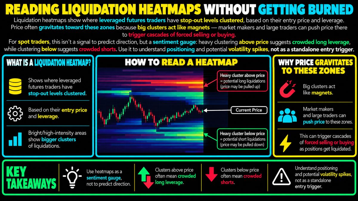
Liquidation heatmaps show where leveraged futures traders have stop-out levels clustered, based on their entry price and leverage. Price often gravitates toward these zones because big clusters act like magnets — market makers and large traders can push price there to trigger cascades of forced selling or buying. For spot traders, this isn't a signal to predict direction, but a sentiment gauge: heavy clustering above price suggests crowded long leverage, while clustering below suggests crowded shorts. Use it to understand positioning and potential volatility spikes, not as a standalone entry trigger.
What A Liquidation Heatmap Actually Shows
A liquidation heatmap is a visual tool, usually built from futures market data, that estimates where large numbers of leveraged traders would be forced out of their positions if price moved to a certain level. Leverage means borrowing capital to open a bigger position than your own money would normally allow. When a trader uses leverage, their exchange sets a liquidation price, the point at which losses eat up their margin and the position gets automatically closed.
The heatmap aggregates these estimated liquidation prices across many traders and displays them as bands of color or intensity, often overlaid on a price chart. Brighter or denser zones mean more estimated positions would be forced to close if price reached that level. These are estimates built from assumptions about typical entry prices and leverage ratios, not confirmed data about every trader's account, so they are approximations rather than exact maps.
Why Price Seems Drawn To These Zones
Clusters of liquidation levels can act like magnets for price, though not through anything mystical. When a lot of leveraged longs, traders betting price will rise, are packed into a narrow band below current price, their forced selling if triggered can accelerate a move downward. The same logic applies in reverse for clustered shorts above price. Some large traders and market makers are aware of these clusters and may have incentive to push price toward them, since triggering a cascade of forced orders can create fast, predictable short-term moves they can position around.
This is why heatmaps sometimes appear to "predict" sharp wicks or sudden volatility spikes toward a cluster. It is less about foresight and more about structural mechanics: a lot of stacked orders in one place creates fuel for a rapid move once price gets close enough to ignite it.
Reading Clusters As A Sentiment Gauge
For a spot trader, someone who buys and holds the actual asset rather than trading leveraged contracts, a heatmap is more useful as a sentiment thermometer than a forecasting tool. Heavy clustering above current price generally suggests a lot of leveraged long positioning, meaning many traders are betting on upside and have built-in stop-out levels overhead. Heavy clustering below price suggests the opposite, a crowd of leveraged shorts.
This information tells you where the market is "crowded" and where volatility could spike if those positions get triggered, but it says nothing certain about which direction price will ultimately go afterward. A cascade of liquidations can resolve in either direction once it plays out.
Common Mistakes And Limitations
A frequent mistake is treating a heatmap cluster as a guaranteed target or a standalone entry signal, buying or selling purely because a zone looks bright. The underlying data is modeled, not verified, exchanges don't publish every trader's exact position, so the clusters are informed guesses that can be wrong or outdated as positioning shifts.
Another limitation is that heatmaps reflect leveraged futures activity, which may not represent the broader market, including spot buyers and sellers who have no liquidation price at all. Relying on the heatmap alone ignores a large portion of real supply and demand.
Fitting It Into A Broader Approach
Liquidation heatmaps work best as one input alongside other tools, such as volume analysis, order book depth, or broader trend context, rather than a trigger used in isolation. They can help explain why a sudden wick occurred or flag where volatility risk is elevated, which is useful for setting wider stop losses or avoiding thin, unpredictable zones.
As with any market tool, there is no guarantee attached to what a heatmap shows. Positioning data changes constantly, and even a well mapped cluster can fail to trigger the move traders expect. Treat it as context for understanding crowd behavior and risk, not as a shortcut for predicting where price is headed.